27/11/2009

Beyond The Boundaries

We were set the 'Beyond the Boundaries' brief along with some visits, the main one being to the Lea Valley Wastelands and Canning Town to see the Olympic 2012 developments, in order for us to look at a part of London in a different way and also to see how the boundaries of that area are being changed. It was quite hard to get close to the actual sites but it was strange being in such a empty, grey and grim place that was still within London. After looking at birds eye images of the area I decided to base my project around negative spaces.

My final pieces were cut outs of all the green spaces in London, one of the pieces is North East, the other is South East. I also exhibited the paper cut out shapes in envelopes beneath the A2 pieces.


01/11/2009

Everything is Connected

A really vague brief to pick something fascinating, research it in depth and communicate it in terms of how it is 'connected'. I chose mould, and the connection aspect is the life-death process that mould causes and also the cycle of mould producing spores-spores escaping into the atmosphere-spores latching onto food etc... . Here are some photo outcomes of food.

Peach

Yoghurt

Kiwi

Plum

Tomatoe

12/10/2009

The Writings On The Wall

We were set a summer project to use walls as a canvas in order to create a 3D narrative...

THE WRITING’S ON THE WALL

An omen for doom or misfortune originating from the book of daniel. In the biblical tale the
fortune of all those attending a feast is spelled out in supernatural writings on the wall. not one of the guests manages to translate the
writing due to the coded nature and so the
prediction of their misfortune goes undiscovered. I have coded six predictions of my future
according to the horoscope pages of the sun, cosmopolitan, the guardian, london lite, daily mirror and heat magazine on the
26th august 2009.

Bound book of all the codes and how to decipher them. The front cover is a sheet of black paper with morse code laser cut out allowing the yellow paper behind to show through.


08/10/2009

More Dictionary

Some extra work from the dictionary project. The definitions set out in their positions on the human body:


The definitions set on a magnification scale:
Bound book of dictionary work.

08/05/2009

The Russian Linesman


One day project. Brief: Design a poster for the Russian linesman exhibition currently on at the Hayward gallery, curated by Mark Wallinger.
Simple idea working with the theme of perspective. Haven't worked too much on the project as I've been focusing on finishing and printing my dictionary but I am pretty happy with the outcome of the poster for a one day project. The colors are coming through weird for some reason.

06/05/2009

Design a dictionary

Design a dictionary project, I have focused on these medical style illustrations of body parts/cells/organs. The definitions that accompany the images are supposed to contrast, seeming like quite nice words against quite gross illustrations.


I've printed 25 different definitions on A5 Heavyweight paper. Really pleased with the outcome of these.

05/05/2009

T-shirts


Just a couple of examples of illustrations for an old project to do designs for T-Shirts. Themes: Nature & Music.


Jbel Toubkal


A few extra bits from the Unknown Land project...


Some drawings from the flour & salt model we made of the mountain 'Jbel Toubkal.'


An example of the religious rules. There was five in total. Each rule has some grounding in different religions from the first survivors on the island but also linking and befitting life on Jbel Toubkal. For example, migration coincides with storm season on the calender and fasting at the same time as drought.

07/04/2009

Unknown Land


Seven week group project to design our own country, including pretty much anything we want, faith, culture, architecture, flag, fashion etc…
We have decided on a post-global warming mountain island where the survivors have lived due to rising sea levels and evolved and set up their own way of life and social structure, between five main tribes who each specialize in different key jobs for the country.

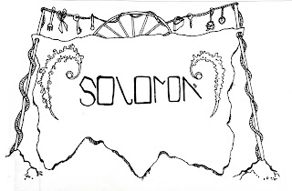
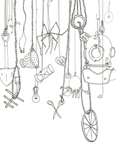
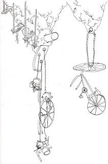
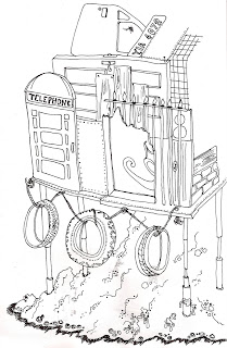
Scavenger Tribe - Solomon


24/03/2009

Microwave Minute

One week group project set by Alex Reuben to create a one minute long video with no pre-recorded sound and no editing.


Worked in a group with five other girls on this. We smashed the front screen of an old school microwave through with a shuvel and microwaved some stuff, bulbs, soap, marshmellows etc...
Really pleased with the final outcome but slightly worried about that the crazy noise couldnt be picked up by human hearing and the fact we probably killed alot of braincells in the making of this video.

Metamorphosis


Only just got round to scanning in an early project on book deisgn + binding. This was for Metamorphosis, a novel by Franz Kafka. Its an a5 hardback book with the cover made from book cloth and the title printed with letterpress. I opted for dark colours and typeface Orator, which uses only capitals, for an isolated and eerie appearance.

23/03/2009

Barbican


A photography project capturing squares+circles+crosses+squares in and around the Barbican Gallery

Cress


One day project, create something typographically appealing with the word cress.

Something From Nothing


We were given a list of anagrams and asked to make a project out of them.I started by simply connecting the letter to create interesting patterns.I thought these would work well as perhaps a code to map a journey and decided to draw similar patterns on a London map.I have also written out area names in a similar way on maps.

Signs Of Life


We were set a project to go out into Camberwell and get a general feel for the area and make observations. I decided to make simple flip books to put this into coherent form, basically breaking down the mass amount of shop fronts to stand alone on each page to make the information more digestible.

I Am A Typeface


A project from the beginning of term, basically 'If you were a typeface what would you be.' It took me far too long to figure out what I actually wanted to say about myself so I decided to just add up all the money I had been spending over my first month in London, and this would hopefully speak for me. Looking back I really don't know why I chose this typeface, but I did so with the intention of developing the project into a typeface I had rendered myself.... must get round to doing that.